
Understanding Texture and Color
Ian Plant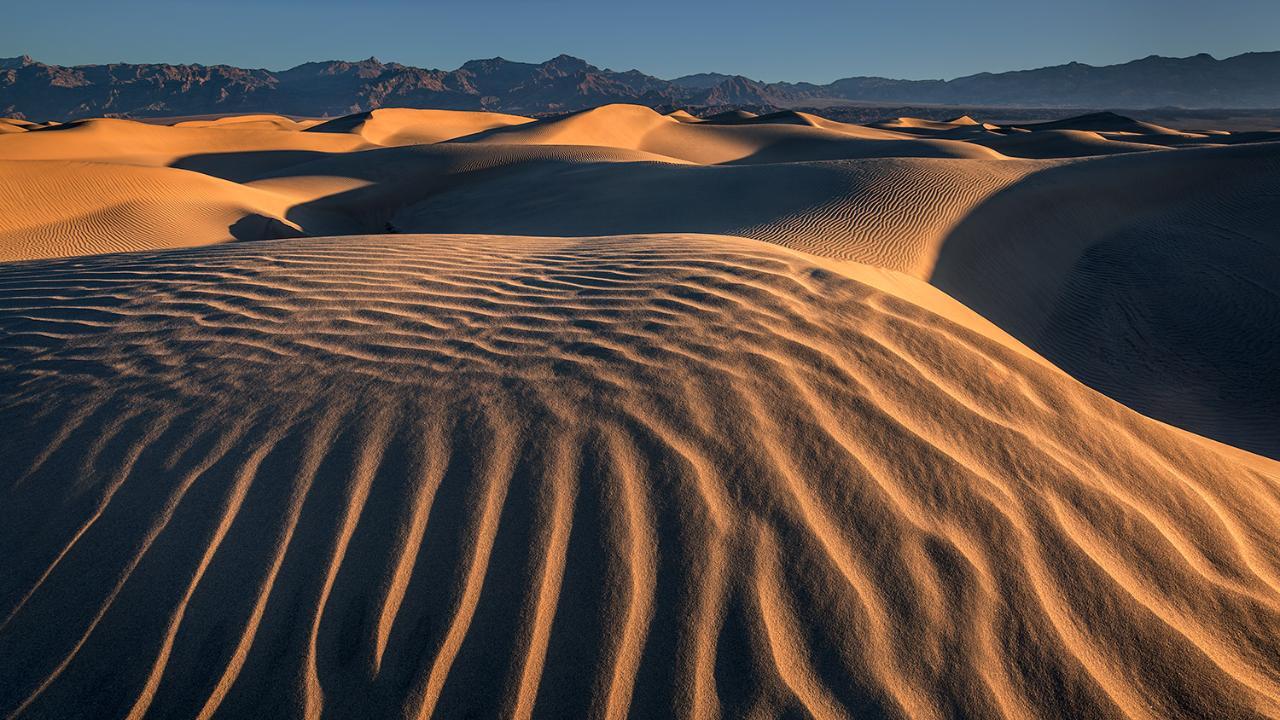
Video Player is loading.
Professional landscape photographer Ian Plant discusses the importance of seeking contrast between colors and light and shadow to create texture in your landscape photos. Texture is important because it creates visual separation between objects, and gives your photos a three-dimensional feel.
Check out this article to learn more on using complementary colors in your photography.
Hey there everyone. I'm professional landscape photographer, Ian Plant. And when I'm out in the field, I'm on the lookout for contrast of light and shadow and color to help create texture in my landscape scenes. When you photograph a lot of landscape scenes in flat light that sense of three-dimensions of depth is lost and there isn't that much visual separation between objects. By looking for contrast of color and light you can restore that sense of three-dimensions and make your landscape compositions much more dynamic.
Colors that are opposite of each other on the color wheel are known by artists as complementary colors and these include color pairs like red verses green or blue verses orange. Instead of memorizing the specific complementary colors I think it's easier to think of this generally as cool verses warm. I'm often looking to juxtapose color opposites to create patterns and shapes in my landscape compositions. Contrast between light and shadow is also really useful when you're trying to create texture in your landscape shots. And the best time to do this is when the sun is low on the horizon usually around sunrise or sunset.
When the sun is low and angled that's when the shadows are gonna be the most sharply defined. It certainly helps to have strong light. If you've got overcast light, you're not gonna get any shadows. So nice strong sunlight is necessary to create that really sharply defined texture. And when the sun is low in the sky you have an extra benefit, it's also very colorful.
And this is useful when you're trying to create that complementary color scheme that I talked about earlier. Because anything that's in the sunlight at sunrise or sunset is gonna be lit by warm colors while the shadows are gonna be considerably more cool. You have to be careful, to set the white balance that's gonna preserve those cool tones in the shadows and the overall complementary color scheme. If you warm things up too much you're gonna spoil the effect. I look for interesting juxtapositions of light and shadow to reveal shapes and patterns in the landscape.
Usually, I find that side lighting works best to reveal texture. So often I am facing my camera 90 degrees away from the sun. So the next time you're out there making landscape photos use low angled light to reveal texture, shape and patterns in your landscape compositions. I'm Ian Plant and thanks for watching.
Great photo work. My work is landscapes of the eastern Appalachian range. Born in WV and have lived in NC for 23 years now. Mostly a landscape artist but enjoy macro. Did a lot of macro while teaching Biology. Slides were easy to use in the classroom. Now I do print work for picture /frame sales. Thanks for you training programs. They help a lot in area I need refreshing. Keep up the great work. :)
thank you! amazing shots. Now I can get my landscapes to pop better